+91 9898181101
 +1 (647) 971-4687
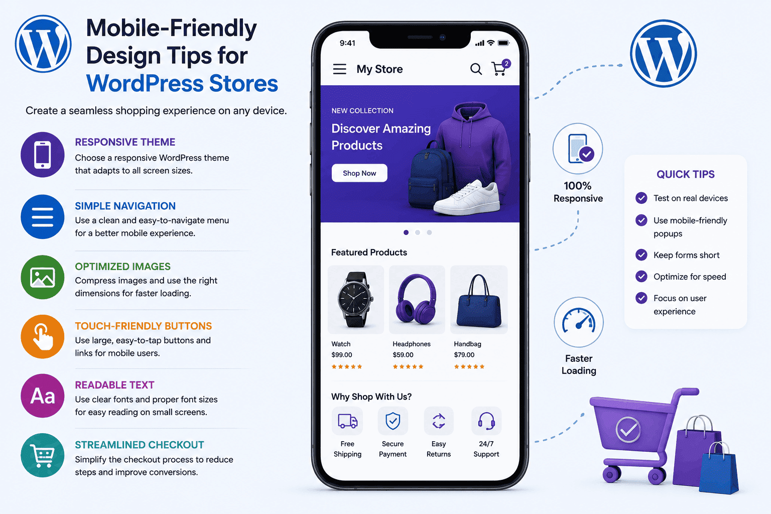
Mobile-Friendly Design Tips for WordPress Stores
The way people shop online has changed dramatically over the last few years. Today, a large percentage of online purchases begin and end on smartphones. Customers browse products during their commute, compare prices while shopping in physical stores, and complete purchases from their mobile devices at any time of the day. For WordPress store owners, this shift means that mobile-friendly design is no longer optional. It has become a critical factor in attracting visitors, improving user experience, and increasing sales.
A WordPress store that performs well on desktop but struggles on mobile devices can lose a significant number of potential customers. Slow-loading pages, difficult navigation, tiny buttons, and poor layouts often frustrate users and cause them to leave before making a purchase. Since customers have countless alternatives available online, even minor mobile usability issues can directly impact conversion rates and revenue.
Creating a mobile-friendly WordPress store involves more than simply making a website fit a smaller screen. It requires careful planning of design, speed, navigation, content presentation, and checkout processes. This guide explores practical mobile-friendly design tips that can help WordPress store owners improve customer satisfaction, boost search engine rankings, and create a better shopping experience for mobile users.
Why Mobile-Friendly Design Matters for WordPress Stores
Mobile devices now account for a significant share of global eCommerce traffic. Consumers expect websites to load quickly, display correctly, and function smoothly regardless of screen size. When a WordPress store delivers a seamless mobile experience, customers are more likely to stay engaged and complete their purchases.
Search engines also prioritize mobile usability when determining rankings. Websites that provide better mobile experiences often perform better in search results. This makes mobile-friendly design an important part of both customer experience and SEO strategy.
Business owners should understand that mobile optimization affects every stage of the customer journey. From product discovery to checkout completion, each interaction influences purchasing decisions. A poor mobile experience can create friction that discourages customers from continuing.
In contrast, a well-designed mobile store builds trust and confidence. Customers feel comfortable browsing products, reading descriptions, and completing transactions when the interface is intuitive and responsive.
Choose a Responsive WordPress Theme
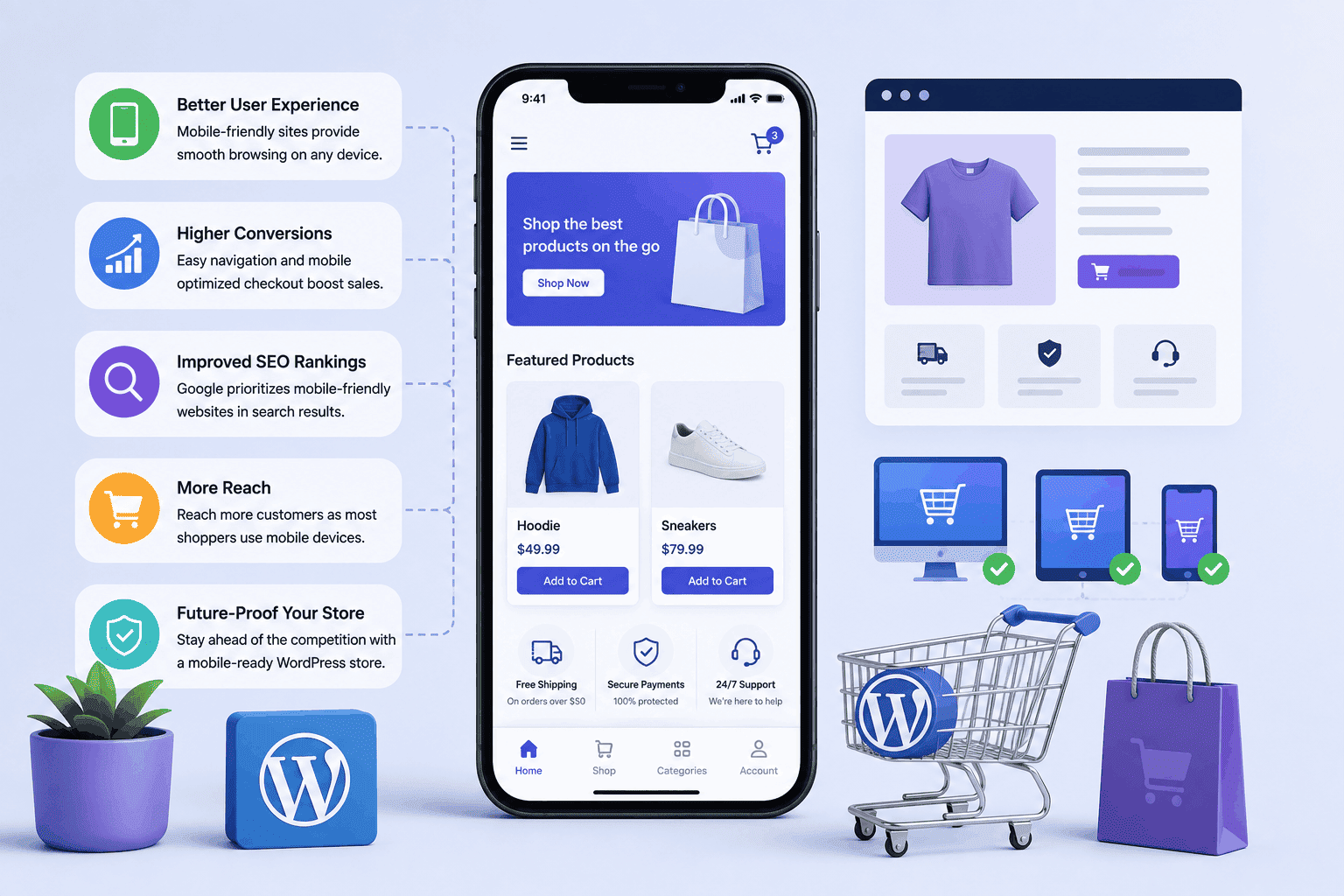
A responsive WordPress theme automatically adjusts layouts, images, and content to fit different screen sizes. This forms the foundation of a mobile-friendly online store and ensures consistency across devices.
Many modern WordPress themes are designed with responsiveness in mind. However, not all themes offer the same level of performance. Business owners should carefully evaluate themes before implementation to ensure they provide excellent mobile experiences.
A responsive theme eliminates the need for separate mobile websites, simplifying management and maintenance. It also helps maintain consistent branding across desktop, tablet, and smartphone devices.
When selecting a theme, testing on multiple devices is essential. What looks attractive on a desktop monitor may not function properly on smaller screens. Real-world testing helps identify potential usability issues before customers encounter them.
Businesses looking for tailored solutions can explore custom WordPress development services to create mobile-first shopping experiences that align with their brand goals.
Optimize Website Speed for Mobile Users
Website speed is especially important for mobile users, who often browse on slower networks or while on the move. Fast-loading pages create a smoother shopping experience and help retain potential customers.
Slow WordPress stores can lead to higher bounce rates and reduced conversions, as users quickly move to faster competitors. Even a few seconds of delay can significantly impact sales and engagement.
Key Factors for Improving Mobile Website Speed
- Optimize image sizes for mobile devices
- Use high-quality, fast hosting services
- Minimize unnecessary plugins and scripts
- Improve overall code efficiency
Regular performance testing helps identify speed issues and optimize mobile experiences effectively. A faster website improves user satisfaction, boosts conversions, and strengthens SEO rankings.
For additional guidance on website performance, review Google’s PageSpeed Insights recommendations.
Design Simple and Clear Navigation
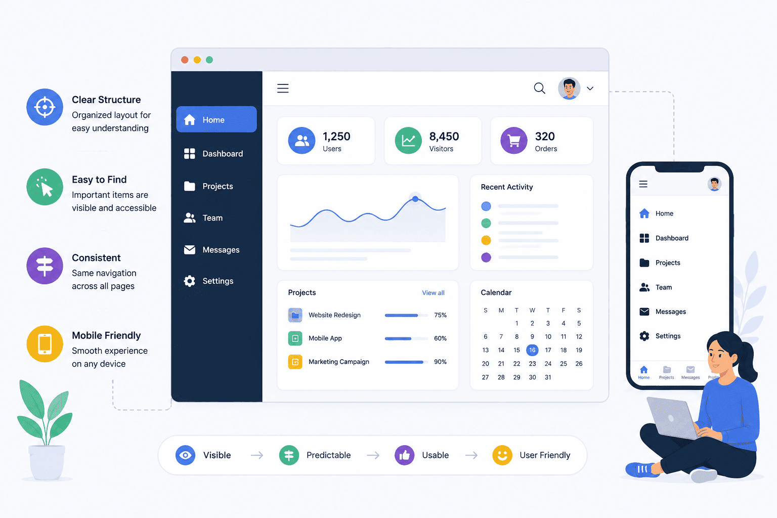
Navigation is one of the most important aspects of mobile usability. Customers should be able to find products quickly without excessive scrolling or searching. Clear and simple navigation improves user experience and increases the chances of conversion.
Mobile screens provide limited space, making it essential to organize menus logically. Clear category structures help users move through the store efficiently and locate desired products faster.
Many successful WordPress stores use mobile-friendly navigation elements such as hamburger menus, sticky headers, and search bars. These features improve accessibility while maintaining a clean interface.
Good navigation reduces frustration and encourages visitors to explore additional products. The easier it is for customers to browse, the greater the likelihood of generating sales.
Effective Mobile Navigation Practices
- Keep menu structures simple and organized.
- Use clear category names.
- Include a prominent search feature.
- Limit unnecessary menu items.
- Ensure navigation buttons are easy to tap.
Make Buttons and Touch Elements User-Friendly
Mobile users interact with websites through touch rather than mouse clicks. This means buttons, links, and interactive elements must be appropriately sized for fingers, ensuring smooth and accurate navigation.
Small buttons can lead to accidental clicks, creating frustration and reducing usability. Users should be able to tap important actions such as “Add to Cart” and “Checkout” without difficulty, which improves overall shopping convenience.
Spacing between clickable elements is equally important. Crowded layouts increase the risk of unintended actions, negatively affecting the shopping experience and user satisfaction. Proper spacing also improves usability and helps users navigate the website more comfortably.
A user-friendly touch interface creates a smoother journey from product discovery to purchase completion. Small improvements in usability can have a significant impact on conversions and customer retention.
Optimize Product Images for Mobile Devices
Images play a critical role in online shopping as customers depend on visuals to assess product quality, features, and appearance before making a purchase. High-quality images help build trust and improve buying confidence. However, large image files can negatively impact mobile loading speed.
Balancing image quality and performance is essential for effective mobile optimization. Modern compression techniques help reduce file sizes without noticeable quality loss, ensuring faster loading times. Store owners should also optimize product galleries so mobile users can easily zoom, swipe, and view multiple images smoothly.
Best Practices for Mobile Product Images
- Compress images before uploading.
- Use modern image formats where possible.
- Enable responsive image sizing.
- Provide zoom functionality.
- Test image performance on multiple devices.
Simplify the Checkout Process
A complicated checkout process is one of the biggest reasons for cart abandonment, especially among mobile users who expect quick and seamless purchasing experiences. Long forms, extra fields, and multiple steps create unnecessary friction. This often leads customers to leave before completing their order.
Simplifying the checkout process can significantly improve conversion rates and overall user satisfaction. Customers prefer fast, easy, and secure transactions with minimal effort. Features like guest checkout, autofill, and streamlined payment options help create a smoother and more efficient mobile shopping experience.
Mobile Checkout Improvements
- Reduce the number of form fields.
- Enable guest checkout.
- Support digital payment options.
- Use autofill functionality.
- Display clear progress indicators.

Prioritize Readable Content
Content readability directly affects user engagement on mobile devices. Text that appears clear and easy to read encourages visitors to spend more time exploring products and information. Mobile-friendly typography enhances overall accessibility and keeps users engaged longer.
Small fonts, poor spacing, and crowded layouts make reading difficult. Mobile users should not need to zoom in to view product descriptions or important details. Optimizing line height and margins ensures a comfortable reading experience on all screen sizes.
Well-structured content improves both usability and SEO performance. Search engines favor websites that provide positive user experiences and accessible information. Consistent formatting also helps customers navigate content quickly and efficiently.
Using clear headings, short paragraphs, and logical formatting helps customers quickly find the information they need before making purchasing decisions. Breaking up content with bullet points or visuals further enhances comprehension and engagement.
Use Mobile-Friendly Popups Carefully
Popups can be useful for promotions, email subscriptions, and special offers. However, poorly designed popups can create significant problems on mobile devices. Ensuring popups are optimized for small screens prevents unnecessary frustration.
Large intrusive popups often block important content and frustrate visitors. Some users may leave the website rather than attempt to close an obstructive popup. Keeping popup size proportional to the screen improves usability and retention.
Mobile-friendly popups should be easy to dismiss and should not interfere with navigation or product browsing. Timing is also important when displaying promotional messages. Strategic placement and delayed triggers help maintain a smooth shopping experience.
When implemented correctly, popups can support marketing goals without negatively affecting the user experience. Balance is essential to maintaining customer satisfaction. Testing different popup formats ensures they are effective without being disruptive.
Focus on Mobile SEO
Mobile optimization and search engine optimization are closely connected, as search engines now prioritize mobile performance when ranking websites. A mobile-friendly WordPress store benefits from faster loading speeds, better usability, and improved engagement metrics. These factors together help strengthen overall search visibility and organic traffic growth.
SEO strategies should include both technical improvements and user experience enhancements to achieve the best results. When mobile visitors experience smooth navigation and fast performance, they are more likely to stay longer on the website. Businesses that focus on mobile SEO often gain a competitive advantage by attracting and retaining more customers through organic search.
Important Mobile SEO Factors
- Fast loading speeds.
- Responsive design.
- Mobile-friendly navigation.
- Optimized images.
- Secure HTTPS implementation.
- Structured content formatting.
Website owners can also follow mobile usability guidelines provided by Google Search Central to improve mobile SEO performance.
Key Factors That Influence Mobile Store Success
A successful mobile WordPress store requires a combination of design, performance, and usability. Each element contributes to the overall customer experience and affects purchasing behavior.
The first key factor is speed. Customers expect pages to load almost instantly, and delays often lead to lost sales opportunities. Investing in performance optimization can provide measurable business benefits.
The second factor is simplicity. Mobile users prefer clean layouts that allow them to focus on products rather than navigating complex interfaces. Clear design reduces friction throughout the shopping journey.
The third factor is trust. Secure payment systems, professional design, and transparent information help customers feel comfortable making purchases from their mobile devices.
Common Mobile Design Mistakes to Avoid
Many WordPress store owners unintentionally create mobile usability issues that affect customer satisfaction and conversions, making it important to identify and fix them early. One common mistake is prioritizing desktop design while neglecting mobile experiences, which leads to poor usability on smartphones. Another frequent issue is excessive plugin usage, as too many plugins can slow performance and cause compatibility problems that affect mobile functionality.
Poor image optimization, cluttered layouts, and complicated checkout processes also contribute to user frustration. These issues often lead customers to abandon purchases and seek alternatives elsewhere.
Common Mistakes
- Ignoring mobile testing.
- Using oversized images.
- Creating complicated menus.
- Adding intrusive popups.
- Requiring lengthy checkout forms.
- Overloading pages with unnecessary elements.
The Future of Mobile-Friendly WordPress Stores
The future of eCommerce will continue to be shaped by mobile technology. Consumer expectations are increasing, and businesses must adapt to remain competitive. Staying updated with emerging trends will be essential for long-term success.
Artificial intelligence, voice search, personalized shopping experiences, and progressive web applications are becoming more common in online retail environments. These technologies are influencing how customers interact with websites. They are also making online shopping more intuitive and efficient.
Mobile performance standards are also becoming stricter. Search engines continue to emphasize user experience, encouraging businesses to invest in faster and more efficient websites. This shift makes optimization a continuous requirement rather than a one-time task.
WordPress store owners who prioritize mobile optimization today will be better positioned to take advantage of future opportunities. Continuous improvement and adaptation will remain essential for long-term success. This proactive approach helps maintain competitiveness in a rapidly evolving market.
Conclusion
Mobile-friendly design is one of the most important investments a WordPress store owner can make. As mobile shopping continues to grow, customers increasingly expect fast, intuitive, and seamless experiences across all devices. Businesses that meet these expectations are more likely to attract visitors, build trust, and generate higher conversion rates.
By focusing on responsive design, speed optimization, simplified navigation, user-friendly checkout processes, and strong mobile SEO practices, WordPress stores can create experiences that support both customer satisfaction and business growth. A well-optimized mobile store is no longer a competitive advantage—it is a fundamental requirement for success in modern eCommerce.